srcset x Descriptor
Bild wird gegen hochauflösendes ausgetauscht, wenn sich das Browserfenster auf einem Retina-Screen befindet
Code
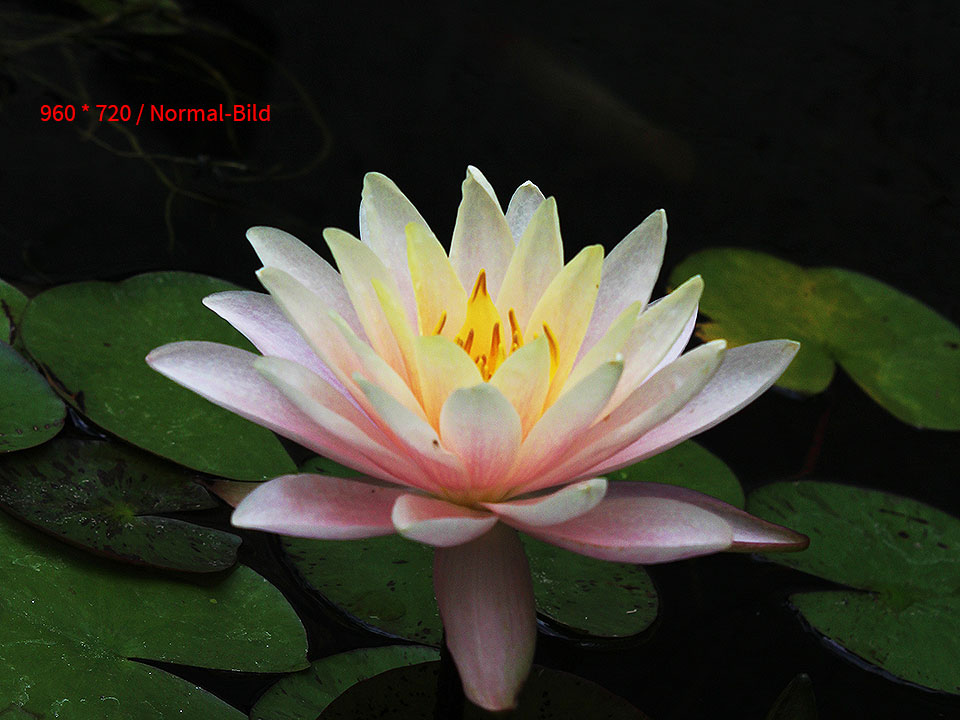
<img src="p/seerose.jpg" alt="seerose" srcset="p/seerose_2x.jpg 2x">

<!-- Beispiel mit weiterer Pixel-Density -->
<img src="cat.jpg" srcset="cat_2x.jpg 2x, cat_2.8x.jpg 2.8x" alt="A funky cat">
Zitat
The value of srcset in the preceding example is a list of the resources for the browser to choose from. Each resource has a descriptor attached to it, which tells the browser something about this resource to make its job of picking the right one easier. In this case, the descriptor in question is the x descriptor, which describes the resource’s density. That gives the browser the knowledge to pick the resource that best fits the user’s screen.
srcset w Descriptor
Now the fixed-dimensions case is great when this is what you need, but in responsive designs the variable-dimensions case is often more common. Your image changes its size as the viewport changes, either due to the fluid layout that contains it or due to a breakpoint change that impacted it.
Code
Im srcset werden Bilder in verschied. Auflösungen festgelegt, die dann beim jeweiligen „Breakpoint“ geladen werden; sizes gibt an, wie breit das jeweilige Bild (hier 100%) dargestellt werden soll.
<img src="p/seerose.jpg" alt="seerose"
srcset="p/seerose_960w.jpg 960w, p/seerose_600w.jpg 600w, p/seerose_300w.jpg 300w"
sizes="100vw">
srcset w Descriptor: Nicht 100% Breite
Lorem ipsum qui ex sale facilis, vel in quidam adolescens. Cum ut ludus homero liberavisse, ex nec lobortis scripserit reformidans. Ignota posidonium ea ius, eos atomorum pericula elaboraret eu. Mea inani deseruisse ea, at nam salutandi instructior, alii impetus dolorem cum at. Nibh eruditi definiebas an mea, per ut sonet debitis delectus.
Principes dignissim dissentias quo ea. Eirmod maluisset mnesarchum vix no, pri eu prodesset definiebas reprehendunt. Vis mutat numquam propriae ea, duo tollit quaeque gloriatur at. Vel ut odio repudiare consequat, qui ex congue inimicus temporibus. Pro cu imperdiet constituam persequeris, volumus facilisis in vis.
Vel ancillae offendit id, te eum nonumy mentitum, id per detracto postulant repudiandae. Tale disputationi et has, in eos feugiat alienum. Sit an amet detracto efficiantur, ut his aeque ridens eripuit. Posse ignota cu vel, in vel nonumy mucius. Et mei erat accumsan efficiendi, nobis nusquam atomorum pro id.
Code
sizes="50vw" sorgt dafür, dass das Bild eben 50% der zur Verfügung stehenden Breite verwendet und die unterschiedlichen Bilder dadurch passend geladen werden. Leider muss man zusätzlich im CSS dann noch die Breite und das Float angeben – Chris Coyer schreibt auf seiner Site auch, dass das eine ungute Vermengung von HTML und CSS ist!
<!-- HTML -->
<img src="p/seerose.jpg" alt="seerose"
srcset="p/seerose_960w.jpg 960w, p/seerose_600w.jpg 600w, p/seerose_300w.jpg 300w"
sizes="50vw">

/* CSS */
img {
  float: left;
  margin: 0 1.3vw 1em 0;
  position: relative;
  top: .5em;
  width: 50%;
}