Media Query: Orientation
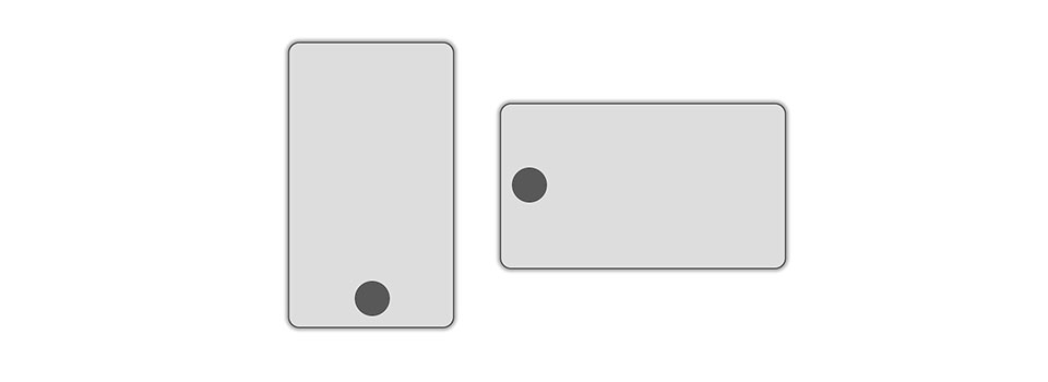
Damit kann man das Seitenverhältnis abfragen – und somit auch, ob man das SmartPhone/Tablet gerade hoch oder quer benutzt.
Online-Demo
Demo – verändert Höhe & Breite des Browserfensters!
Wenn die Breite größer als die Höhe ist, wird die Media-Query „landscape“ aktiv.
CSS
#smartPhone {
    background: #ddd;
    border: 1px solid;
    border-radius: 10px;
    width: 100px;
    height: 100px;
    margin: 20px auto;
    /* Elternelement! */
    position: relative;
}

/* home-Button */
#home {
    border: 1px solid;
    width: 30px;
    height: 30px;
    border-radius: 50%;
    position: absolute;
    background: rgba(0,0,0,.6);
    left: 35px;
    bottom: 35px;
}

/* Querformat */
@media only screen and (orientation: landscape) {
    /* SmartPhone im Querformat */
    #smartPhone {
        width: 260px;
        height: 150px;
    }

    /* Position des Home-Buttons */
    #home {
        left: 10px;
        bottom: 60px;
    }

    /* der richtige Text wird sichtbar gemacht */
    .kein_Smartphone {display:none;}
    .landscape {display:block;}
    .portrait {display:none;}
}

/* Hochformat */
@media only screen and (orientation: portrait) {
    /* SmartPhone im Hochformat */
    #smartPhone {
        width: 150px;
        height: 260px;
    }

    /* Position des Home-Buttons */
    #home {
        left: 60px;
        bottom: 10px;
    }

    /* der richtige Text wird sichtbar gemacht */
    .kein_Smartphone {display:none;}
    .landscape {display:none;}
    .portrait {display:block;}
}